Quantcast
Channel: Yuki Nakamura » Artwork

TransFORM

$
0
0

Site Responsive Public Art Project at Bay Terrace, Tacoma Housing Authority ‘s housing development located on the corner of South 27th Street and Yakima Avenue, Tacoma, Washington

Title:

TransFORM

Concept:

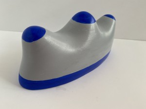
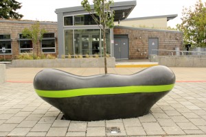
TransFORM is designed to be welcoming like a gateway, comfortable like furniture, dream like as a pillow, and solid like a tanker ship. TransFORM is a sculpture, a gateway and a bench that reflects comfort and a solid sense of security. It is a metaphor and an anchor for people who are having a transforming experience in their lives. My work contributes to create a sense of community, inspire imagination and reduce stress in the intense, confused and chaotic environment. I explore how my sculpture influences its surrounding space and area, including light, sound, movement, texture, and color. 3 pieces are installed in slightly curved line along with integrated lighting in the ground.

 Site Specific:

For the specific site, I chose the SW Plaza – Community Center Connection to Building A in the corner of Court G and S. 27th Street. In the overall site design concept, this area is called “Active Zone,” where main entry, drop-off, woonerf, and shared space are considered. My design concept is a response to the Bay Terrace Community that addresses sustainability, diversity, and revitalization.

* A woonerf (Dutch pronunciation: [ˈʋoːn.ɛrf]) is a living street where pedestrian and cyclists have legal priority over motorist as implemented in the Netherlands and in Flanders.              Techniques include shared space, traffic calming, and low speed limits.

Material:

Concrete is an ideal material for its solidity, sustainability and durability. My design forms it into an organic and fluid bench conveying more movement and softer lines to integrate with a surrounding landscape.

Scale:

The size is approximately 72” in length, 24” in height and 18” in depth. Based on Bench Design Guidelines, the sitting area is 18–20 inches, which is the most comfortable height. 3–4 inches will be added to 24 inches of above-ground height for underground installation.




Drifting Bottles

$
0
0

漂着瓶

2016

磁器、砂

コンセプト:

21年前、1995年に阪神淡路大震災が起こった数ヶ月後に日本を発った。四国の自宅で、地鳴りで目を覚まし、横揺れを2、3分間経験した。震源地からかなり離れた場所であったにもかかわらず、それはとても激しい揺れであった。新幹線の中から復興中の神戸を複雑な心境で見ながら通り過ぎた。それ以来シアトルを拠点に制作活動を続けている。


小学生の頃、四国の高松から鳴門までの海岸沿いを仕事で往復する父のトラックによく乗車した。学校で話題になった海外から漂着した手紙入りの瓶のニュースに影響され、立ち寄る海岸では瓶を探した。瓶に手紙を託し、海の向かうの誰かが拾って連絡をしてくれるのを期待しながら、波に向かって投げた。波が瓶を押し戻し、拾っては投げ入れた。違う国の人と繋がる夢を、海の地平線に見た。まだインターネットもメールも無かった子供時代である。


月日は経ち、2011年に東日本大震災で津波が町や人を飲み込んだ。数年後に太平洋の対岸であるアメリカ西海岸に大量の津波の漂着物が流れ着いた。魚船、ボート、オートバイ、生活用品、木材、サッカーボール、漁業用品、灯油ポリタンク、ペットボトル、発泡スチロール、電球、個人名を記した物や大型漂着物もあった。


兵庫県立美術館での作品は『記憶・時間・距離・繋がり』を時差としてとらえ表現する。瓶に手紙を入れて海に投げ入れ知らない人にメッセージを託すコミュニケーション、時差や時代、距離を越えて、一個人との繋がりを共有するコミュニケーションを表現する。ebayで古い瓶を購入し、それらを石膏で型をとり、泥漿 (粘土と水を混合状態にしたもの)を石膏に流し込み形成し、焼成する。瓶は時代的に古いもの、海に流すのに形状的に丈夫そうなもの、大きさ、形の美しいもの、特別な文字が入っているものを基準にした。一個一個の作品にシリアルナンバーとして0001からのナンバーを刻印している。

Connections 2015

$
0
0

Connections, 2015

Used soccer balls, spray-paint

5 x 5 x 5 ft.

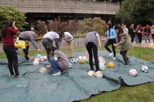
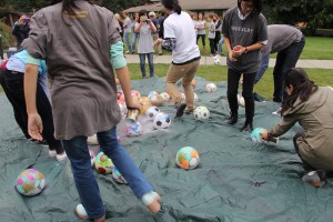
This site-specific installation is a part of Charles Wright Academy Global Summit 2015 which brings high school students from Poland Germany, China and Colombia to the campus to explore diverse perspectives through personal connections and friendship. My project started by collecting used soccer balls from various communities. We spray-painted all over the balls to create surreal map-like global landscapes.


Evolution: Art, Science & Adaptation 2016

$
0
0

EVOLUTION: Art, Science & Adaptation

A special exhibition at Seymour Conservatory, Wright Park
W.W. Seymour Botanical Conservatory and Metro Parks Tacoma are pleased to present EVOLUTION: Art, Science & Adaptation, January 12-March 6, 2016. In this exhibition, 12 Northwest contemporary artists will take a unique approach to evolution through works of sculpture, ceramics, video, diorama and landscaping.

ARTISTS
Sean Alexander + Paul Cavanagh + Don High + Ed Kroupa + Yuki Nakamura + Claudia Riedener + Phil Roach + Jennifer Robbins + Susan Surface + Dion Thomas + Brent Watanabe
Curator: Lisa Kinoshita


Black & Red Jersey

$
0
0

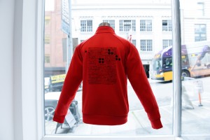
Black & Red Jerseys

Collaboration by Yuki Nakamura and Mayu Kuroda

“Black & Red Jerseys” is a collaborative project by London-based artist Yuki Nakamura and Kobe-based Mayu Kuroda. This project is a part of ”

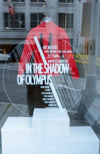
 In the Shadow of Olympus” organized by ART BEASTIES at SOIL Gallery in Seattle.

In the lead-up to the 2020 Tokyo Olympics the world is turning an eye towards Japan, and there is increasing interest in Japanese culture. While diversity and globalization stand as national goals, Japan’s own unique identity is beginning to come into focus once more as well. In the course of our collaboration we came to the realization that the jersey transcends its role as a uniform to constitute a certain type of cultural symbol.

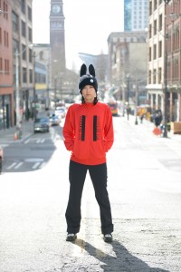
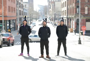
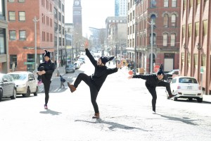
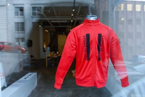
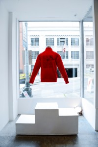
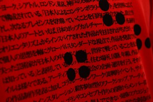
Our project consists of two parts: One is the design and production of an official Art Beasties jersey to be worn in a group performance, and the other is the development of a separate original jersey as part of an installation.

Our conception of the jersey incorporates two main significations in the context of the project.

The first relates to its role as a uniform worn by athletes in the Olympics, with each country maintaining their own. Although they may not make a particularly vivid lasting impression on the public consciousness, the design of these jerseys employs nationally symbolic brands and designers, and athletes who represent their country wearing them do so tasked with such missions as winning medals.

The second concerns the fact that in Japan students wear matching school jerseys in junior high and high school. They vary in color and design from school to school but are generally worn in class and are items that will carry a sense of nostalgia to those who have attended school in Japan. Such matching outfits give rise to feelings of solidarity and belonging in students who wear them before they may even be aware and also to a sense of responsibility that attends the emblazoning of their school’s name on the uniform.

In this project the act of wearing the jersey makes an expression of the statement that “Art Beasties is made up of artists based in five different cities who work individually and form a collective, the ART BEASTIES.” Wearing the jerseys in our day-to-day lives after returning to our own cities will create opportunities for us to boost public awareness of our collective. Also in time they may come to engender senses of belonging and affinity among us even when we are separated geographically.

Yuki Nakamura and Mayu Kuroda

Black & Red Jerseys 2018

Jerseys, Air Mannequin, Foam

(English Translation by Jonathan Way)

黒と赤のジャージ

コラボレーション:中村ユキ 黒田真由

「黒と赤のジャージ」のプロジェクトはロンドン在住のアーティスト中村ユキと神戸在住の黒田真由のコラボレーションである。

東京オリンピック2020に向け、世界が日本に注目し、日本文化への関心が高まっている。多様化、グローバル化が国を挙げての目標となっているが、日本独自のアイデンティティも再注目され始めている。2人のコラボレーションではジャージがユニフォームを越えて、ある一種の文化的象徴であることに気づく。

プロジェクトは2部構成でアートビーシティーズのグループパフォーマンスに着用するジャージのデザイン・制作とグループジャージとは別にデザインしたジャージを含むインスタレーションとなっている。

ジャージのコンセプトは我々のプロジェクトにおいて2つの重要な意味を含んでいる。1つ目は、オリンピックにおいて選手が着用するユニフォームとして各国のジャージが存在している。そしてその存在は世間の意識にはあまり鮮明に残らないが、各国を象徴するブランドやデザイナーを起用し国を代表する選手がメダル獲得などの使命を背負い着用している。

2つ目は、日本では中学高校において学校で統一されたジャージを着用する。学校によって色やデザインは異なるが主に授業において着用し、日本での学生生活を送った者には懐かしいアイテムである。統一した衣服には連帯感、帰属意識、ジャージに記された学校名を背負うことの責任感を本人も気づかぬうちに生み出している。

このプロジェクトは『アートビースティーズが、5つの都市を拠点に個々に活動するアーティストコレクティブ“ART BEASTIES”』であるということが、このジャージを着用することによって表現される。それぞれの拠点に戻り、日常生活において着用されることはグループの存在を社会に知らしめる機会となる。またグループが同じ場所に存在していなくても、個々へもたらされる帰属意識や愛着を時間の経過とともに与えるものになるかもしれない。

中村ユキ、黒田真由

黒と赤のジャージ  2018年

ジャージ、エアマネキン 、フォーム

Photo by Tokio Kuniyoshi

Models by Mayu Kuroda, Kakeru Asai, Masaya Nakayama, Tokyo Kuniyoshi


Reading the map

$
0
0
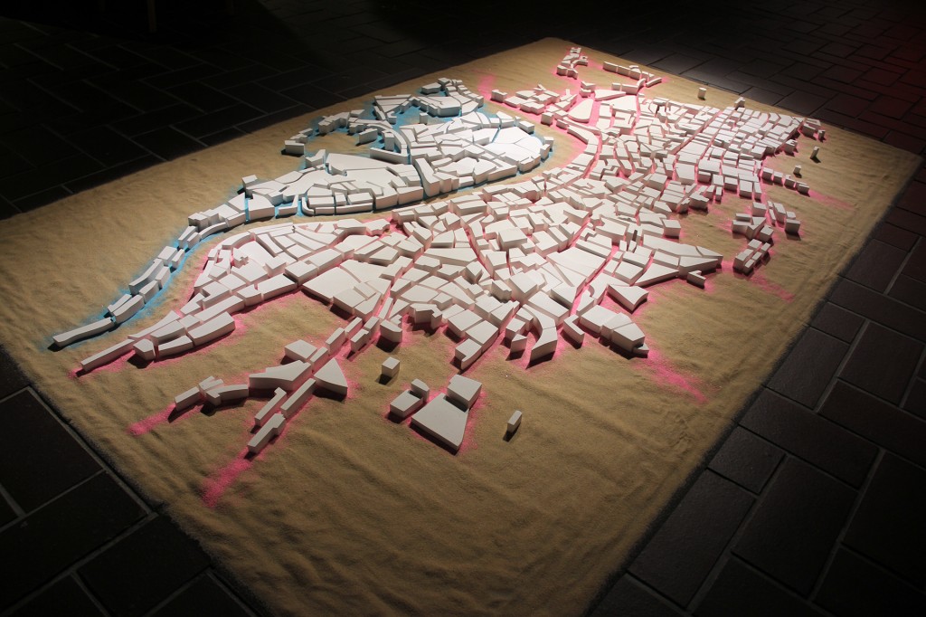
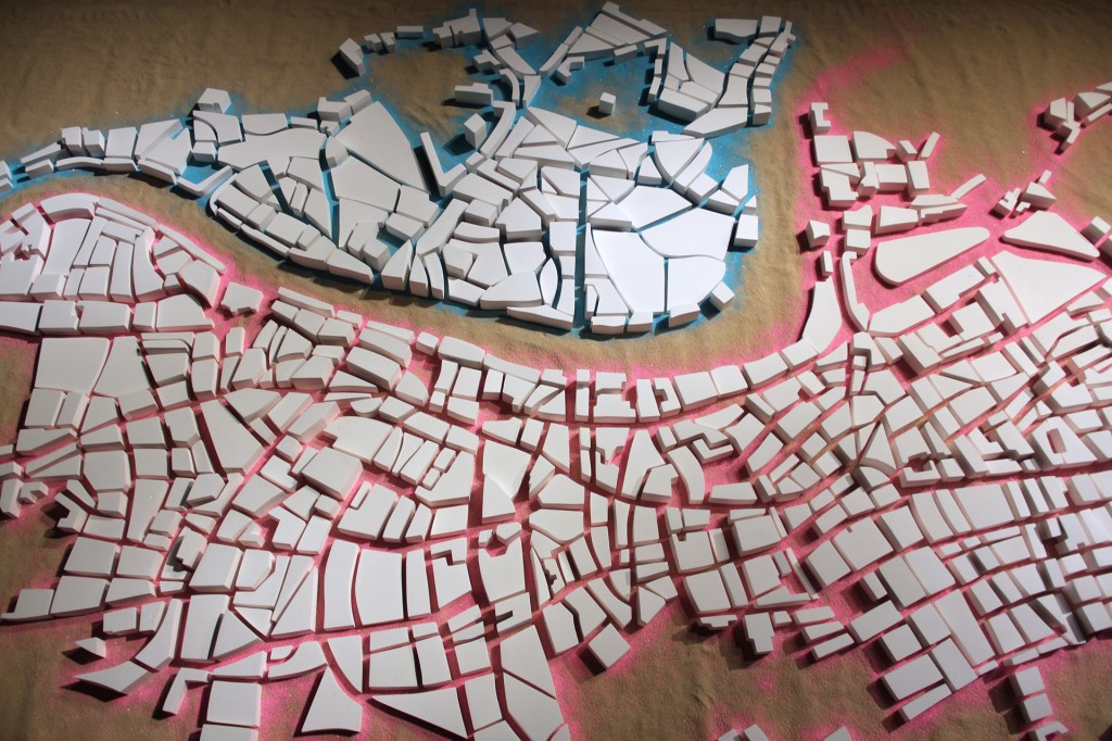
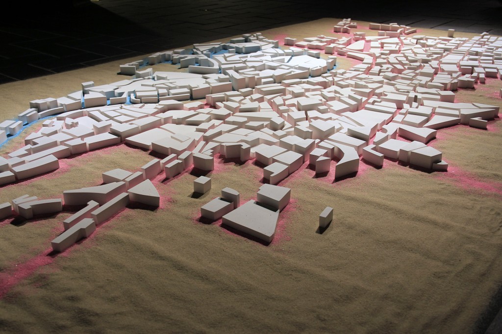
Reading the map, 2018

Hydrocal Plaster, sand

180 cm x  290 cm


BUTTERFLY FLUTTER TIME DIFFERENCE vol.3 New York-Seattle-London-Tokyo

TOKYO METROPOLITAN ART MUSEUM TOBI SELECTION GROUP EXHIBITION 2018

June 9–July 1, 2018

Organized by ART BEASTIES

Supported by The Asahi Shimbun Foundation and Japan Arts Council


CONCEPT

Based on an 1806 map of London, I reconstruct the city out of minimal blocks. Eliminating names and

symbolic elements from the map, I intentionally minimize it. Through my emphasis of its graphic aspects,

it turns into an imaginary city.

The sound of the Japanese word habataku “to flutter,” gives me a vision of quiet, irregular ripples, the

flow of time, a city flocking together and taking shape. The city, a chaotic pattern and an aggregation of

organic forms, marks the course of history over the long years and has the capacity even to regenerate

when disaster or war may shatter it.

What we call above ground now is situated atop all the things that have accumulated below. Walking

above ground, all the things that must be buried beneath — the history and culture, the people’s way of

life — draw my attention in. A map’s symbols and forms change constantly, almost as if it’s living. Taking

in an array of different influences, it takes on a different form to connect with another city and future far

away.

In 2017 I drew my 23 years of art production activity in Seattle to a close and moved my base to London.

In a timezone 8 hours ahead of Seattle and 9 hours behind Tokyo (8 during British Summer Time), it’s

located just about halfway in between them in terms of time difference. There was a period at first when I

just felt a sense of confusion at the chaotic comings and goings of people on the streets of the city, but

gradually I came to realize that the scenes I’d thought of as chaos were passersby, those alleyways over

there, streets, buildings. In that way, these things that hadn’t been visible to me began to form points,

connect together and come to be people and places familiar to me. (* The “alleyways” I speak of here are

London’s mews, alleyway courtyards that once housed stables and servants, now an upscale residential

district.) At a real estate agency in London, an enlarged map of the area is plastered across the whole

wall. With that map you can get a feel for an overall picture of the city and narrow down where you want

to live. There’s an expression “to read a map,” but it demands that you have the spatial cognition to grasp

things’ forms, locations, sizes, distances, and so on. Maps contain abstract, conceptualized graphics and

symbols, and of course they require language comprehension skills as well. An understanding of the

correspondence between a map and the actual landscape it represents allows one to read a city. It was

my gazing at a map that gave this project its start.

(English translation by Jonathan Way)


街を読む

2018

石膏, 砂

180 cm x  290 cm


東京都美術館ギャラリーC 都美セレクション グループ展 2018

蝶の羽ばたき Time Difference 時差 vol.3 New York-Seattle-London-Tokyo

2018年6月9日-7月1日

ART BEASTIES 企画

助成 公益財団法人朝日新聞文化財団、芸術文化進行基金


1806年のロンドンの地図を元に、最小限のブロックで街を再構築する。地図上から名前や記号的な部分を消滅させ、意図的に間引く。図形的な部分を強調することによって、架空の街となる。

「羽ばたく」という日本語の響きから、静かで不規則な波紋と時間の流れ、寄り集まって形が作られた町をイメージしている。カオス的なパターンであり有機体の集合体である街は、長い年月をかけ、歴史を刻み、時に災害や戦争で崩壊しても再生する力強さがある。

今現在私達が地上と呼ぶ場所は、あらゆる蓄積物の上にある。地上を歩いていて、地下に埋もれているであろう歴史や文化、人々の生活に想いを寄せる。地図上の記号や形は常に変化している。まるで生きているように。様々なものを飲み込みながら形を変え、そうして遠く離れた街、未来に繋がっていく。

2017年にシアトルでの23年間の制作活動に終止符を打ち、ロンドンに拠点を移した。シアトルまでは時差ー8時間、東京まで+9時間(夏時間は+8時間)のほぼ真ん中の時差に位置する。当初は街中で道を行き交う人のカオスにただ戸惑うような日々であったが、段々と、カオスだと思っていた風景もすれ違う人、そこにある路地(*)、道、建物だと気付き始める。そうやって見えなかったものが点となり、繋がっていき、馴染みの人や場所となる。ロンドンの不動産屋には、地域の拡大された地図が壁全体に貼られている。その地図で街の全体像を把握してどこに住みたいのか絞り込む。「地図を読む」という表現があるが、物の形、位置、大きさ、距離などを把握する空間認識能力が要求される。抽象化、概念化された図形や記号が地図には含まれており、またもちろん言語理解の能力も必要とされる。

地図と現実の風景との間に対応関係があることを理解することによって、「街を読む」ことができるのである。

地図を眺めることから、このプロジェクトは始まった。

* ここで言う路地とはMEWSのことで、もともとは個人の馬屋だったが住まいに改造された建物が並ぶ通り。現在は高級住宅路地である。


There Is No Answer: Carved Clay Balls

$
0
0

Cornish College of the Arts: Arts Incubator Residency

Duration for ART BEASTIES residency : January 20th ~February 2nd, 2020

at Alhadeff Studio : 201 Mercer St, Seattle, WA 98109.(Seattle Center behind Cornish playhouse)

2020

Performance/Installation

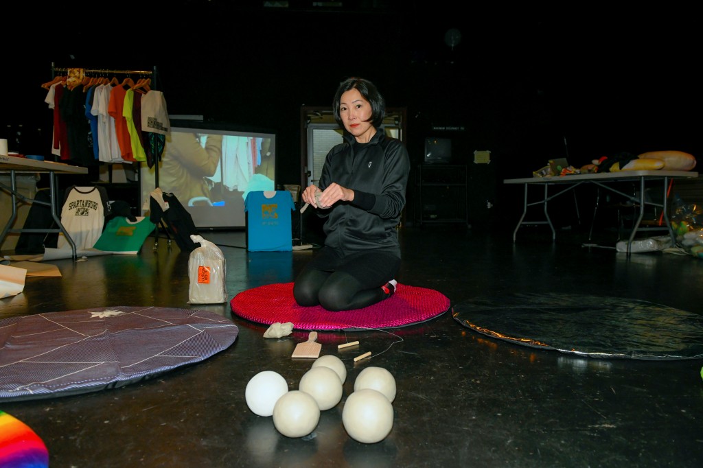
Fabric, Clay, Tools, Camera

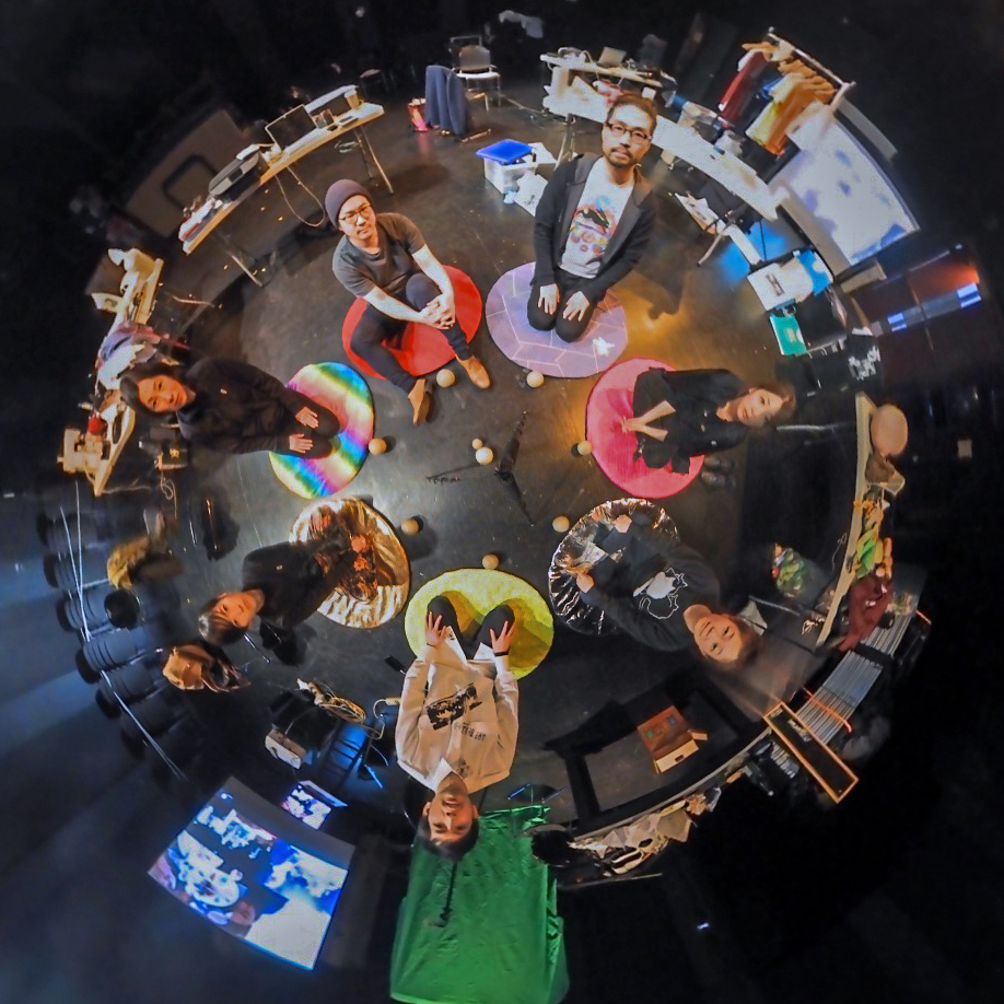
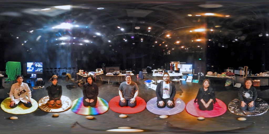
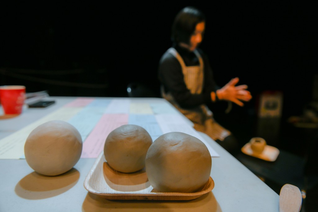
During the Cornish’s Arts Incubator residency, I worked on my individual project while the collective Art Beasties staged a “co-working” office space inside Alhadeff Studio – a theater space. By setting up multiple cameras, such as Time-Lapse, Go Pro and 360 camera, our activities in the space were documented from the beginning to the end.

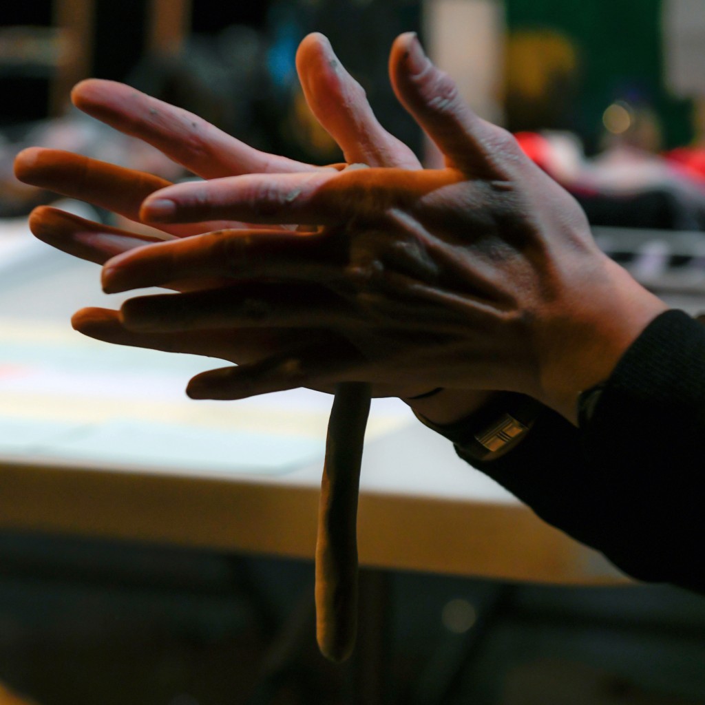
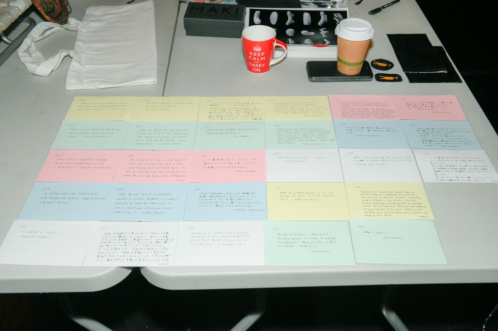
In prior to my residency, I requested friends to provide me with One Question regarding me. The questions became a part of my experimental and hybrid performance/installation work. There Is No Answer: Carved Clay Balls. I contemplated to respond to the question while making a clay ball using a coil pinching technique by sitting on a fabric rug.

Photo: Tokio Kuniyoshi


Meanings

$
0
0


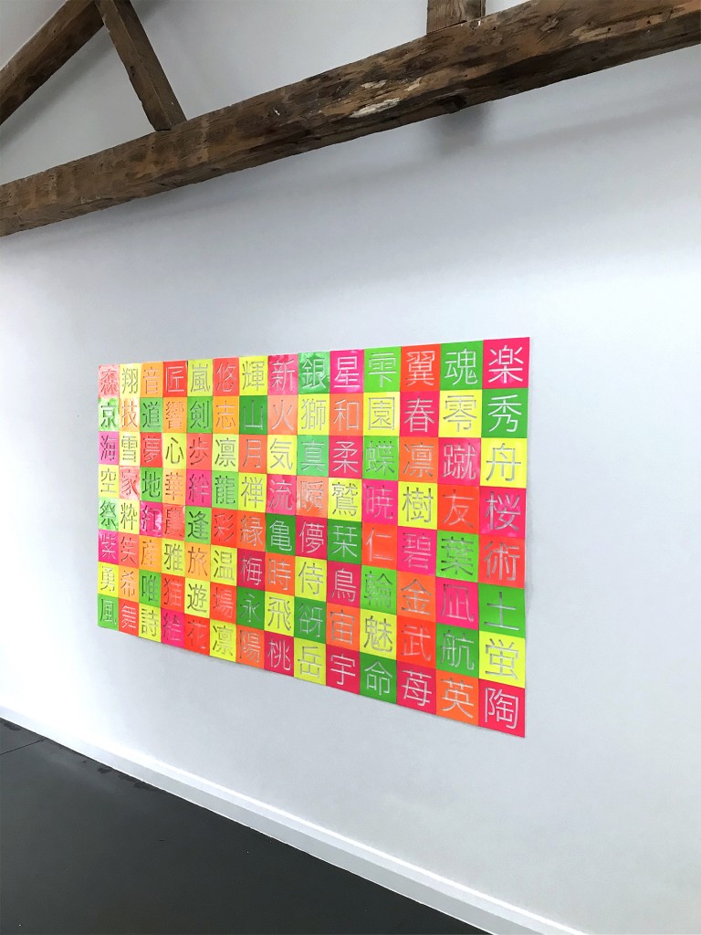
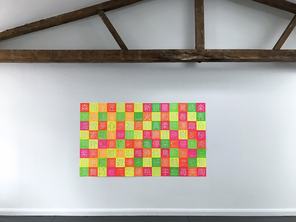
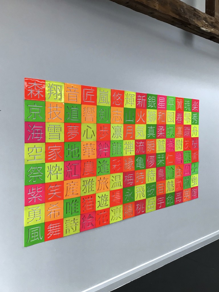
I explore the simplicity of ideograms and powerful meanings of selected Kanji characters though incomprehensive to most viewers, becoming a landscape of the visual symbols.


PlayFORM

$
0
0

PlayFORM

Site-Responsive Public Art, Overlake Village Plaza, New Light Rail Station connecting Downtown Seattle with the Microsoft Campus

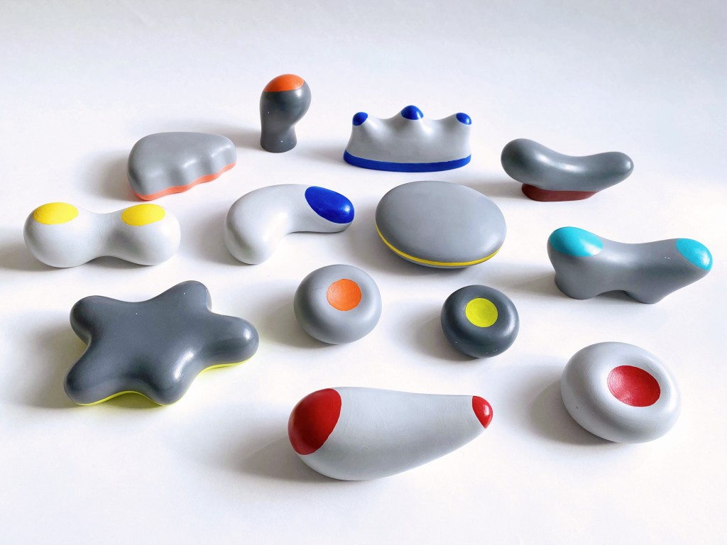
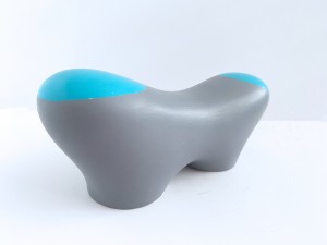
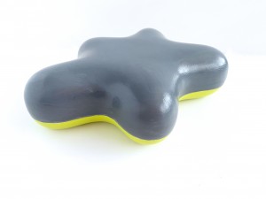
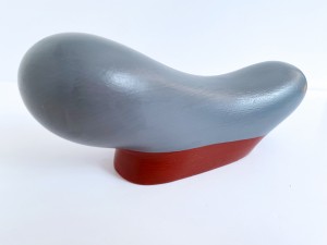
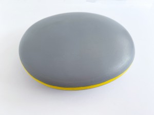
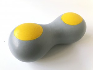
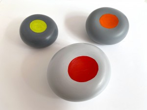
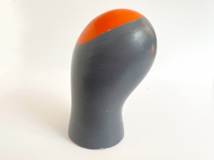
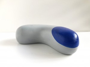
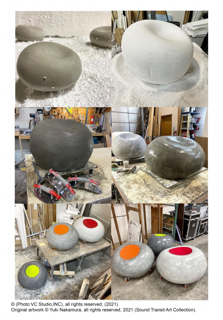
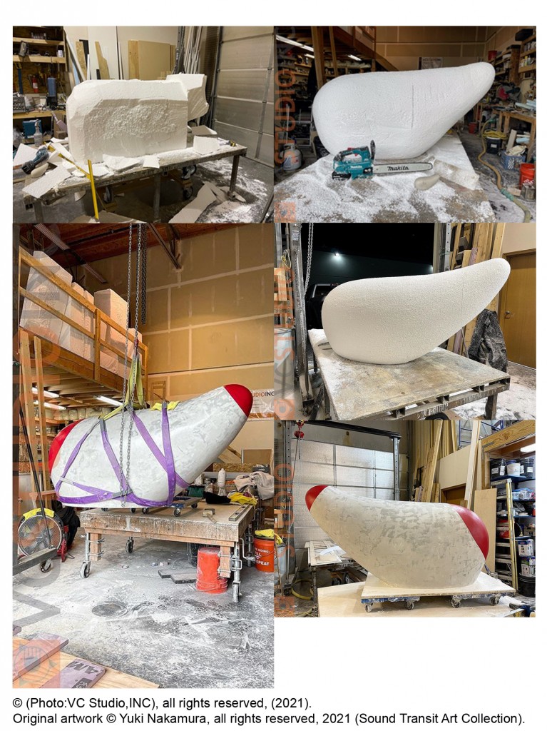
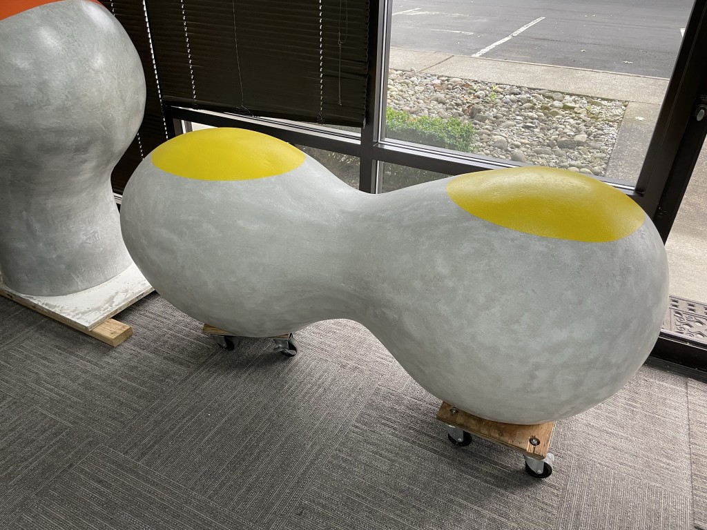
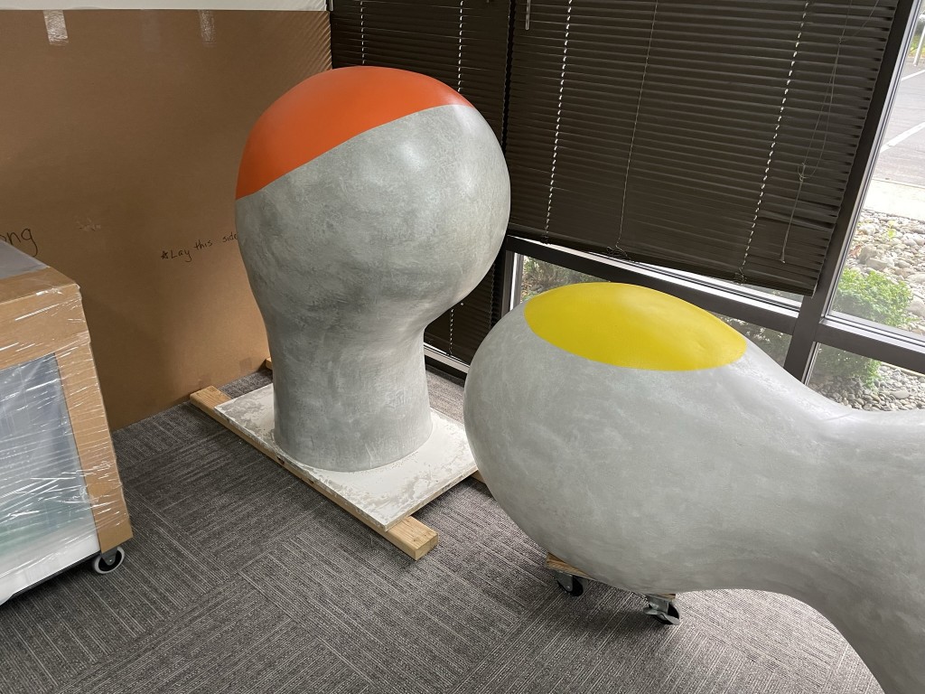
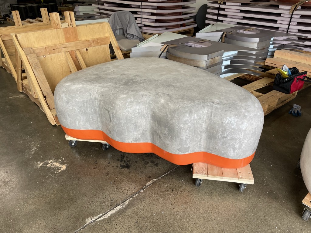
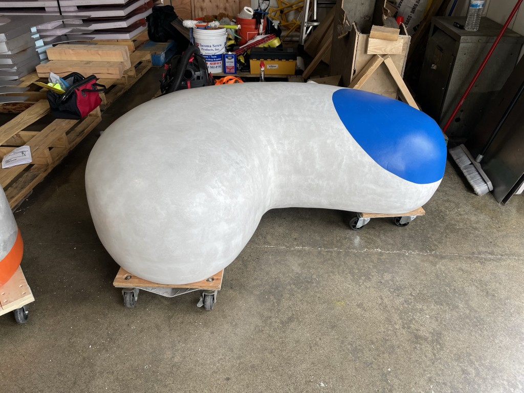
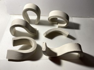
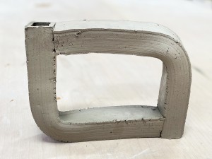
PlayFORM is an upcoming public artwork that will be installed at the Overlake Village Plaza, featuring 13 concrete benches with fluid and organic shapes. The design of these benches is intended to create a lively and playful atmosphere, particularly aimed at families, including children, who will settle in the area in the future. The combination of vibrant colours and soft lines is expected to draw viewers to interact with the sculptures and contribute to the overall ambiance of the space.

The benches serve a dual function as beautiful sculptures and practical seating options or safe barriers. To create the benches, the designers utilized Glass Fibre Reinforced Concrete, a high-strength material that ensures durability and longevity. Each bench was crafted by manually carving Styrofoam to create the desired shape before spraying concrete on top. Each bench was then hand-painted meticulously to achieve the intended aesthetic. The benches range in weight from approximately 300lbs to 2000lbs.


Clay Models


30works/30days

$
0
0


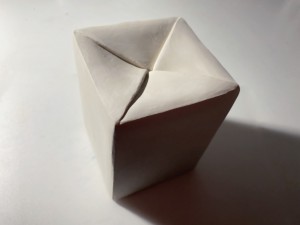
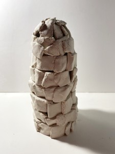
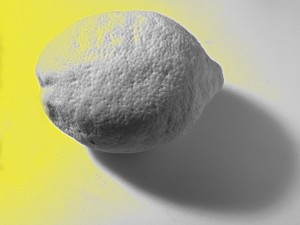
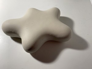
During the month of April, 2023, I participated 30works30days by Artqwest encourages daily making, risk taking and experimentation. Responding to a brief which was delivered by email everyday, I created a new work and uploaded it to the 30works30days website by midnight every day.
Brief:

Day 1 – What one art work would you take to a desert island

Day 2 – Use a new material

Day 3 – Do something backwards

Day 4 – What is your art practices superpower

Day 5 – Do a thing today that you think you’ll be bad at.
Day 6 – Pretend to be a different artist for the day

Day 7 – Share a secret

Day 8 – Make a work inspired by something you heard today

Day 9 – Make your last ever art work

Day 10 – Collaborate with someone else today

Day 11 – Try cheating today

Day 12 – Use the last message/ letter/ email you received as your brief

Day 13 – Remake yesterday’s work

Day 14 – Experiment with ways to document your work

Day 15 – Make your work commercial

Day 16 – Have a party

Day 17 – Make a work from your window

Day 18 – Make a work about the ugliest thing you have seen in the past 24 hours

Day 19 – Take the unsolicited advice about your work

Day 20 – Don’t make anything today. Just send a description of what you would mak

Day 21 – Make your work more accessible

Day 22 – Make a work and exhibit or leave it in a public place for someone to find

Day 23 – Break something

Day 24 – Do one less thing today

Day 26 – Make a work in the inbetween time. Make a work while you’re doing/ waiting for something else…

Day 27 – Use an old artwork to make a new one

Day 28 – Go smaller

Day 29 – What brings you joy? Make a work by doing that.

Day 30 – Make a commitment


Latest Images